
Only about half of people who need food assistance are getting it, according to data from our 2023 Hunger Report. We’re dedicated to addressing the barriers to food assistance, so we can reach as many of those in our community who need help accessing enough nutritious food.
But how do we go about doing that? That’s where one of our most powerful data tools comes in: the Hunger Heat Map.
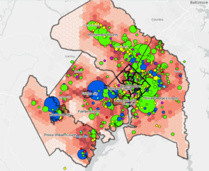
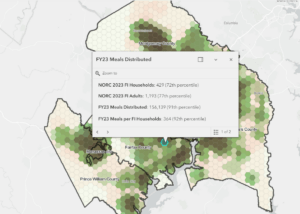
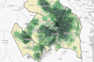
The map helps us to visualize the landscape of hunger in our region, seeing where the highest levels of food insecurity are and where we need to create new food distributions, find new partners, or innovate our approaches. This is a tool we’ve been using for years, but recent updates now allow us to work with renewed accuracy and precision.
The biggest question the map helps us to ask is this: are there locations where people aren’t getting help as much as other locations? One layer lets us look at two things at the same time – the level of food insecurity in a given area and how much food people are accessing in that area.
The black squares represent areas that have high levels of food insecurity but low levels of food distribution. That means that there are people there who need food but aren’t getting it – at least not from us or our partners. This helps us know if we need to add new direct distribution sites there, or if there are other organizations we should be partnering with in that area.
The heat map also helps us to look at how well we’re serving different ethnic identities. If there are inequities in how we’re reaching different ethnic populations, there may be adjustments needed to our distribution strategies.
The next step for us is to look more closely at the types of food getting distributed in areas with those kinds of discrepancies: what percentage of it is culturally appropriate? What cultures are accessing foods targeted to their needs – and what cultures might we be missing?
Another possibility is that people aren’t accessing the food because the staffing and other resources at food distributions might not be in a familiar language, and they either don’t know the sites exist or don’t feel comfortable engaging with them. Identifying these types of locations allows us to recruit new partners or develop new capacity among our existing partners to reach out in more languages.
The Hunger Heat Map has been a wildly helpful tool in guiding our work so far. Given its new capacity for accuracy and precision, we’re so excited for how it can even better enable us to serve our community.
This is just a handful of information you can find on the Hunger Heat Map. Click the button below to explore it in detail.