Hunger stretches across the map of our area.
But in a region known for its affluence, that can be challenging to see. Our Hunger Heat Map reveals the breadth of the problem—and lets us know where help is most needed.
The CAFB has made recent updates and improvements to its Hunger Heat Map. The food bank uses this interactive map to understand where food insecure people area and to measure the impact that we and our partners have on our communities. Using this map, we leverage a spacial understanding of the food need to develop data-driven solutions and ultimately reduce food insecurity in our area.
4 Things You’ll Find on the Hunger Heat Map
- Hunger is much more widespread than people realize. One out of every ten residents in the Washington metropolitan region is food insecure – and nearly 30% of them are children. The image below is a birds eye view of the CAFB’s wide service area showing the density of families and individuals experiencing food insecurity across the region, with the darkest red areas showing the areas with highest concentrated need.
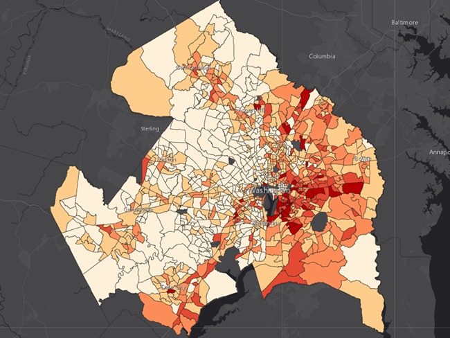
Select the layer ‘Need: Food Insecure Population’ to explore this data on the Hunger Heat Map. - Food insecurity is difficult to escape. Both literally and figuratively. The Heat Map was recently updated to show a new piece of the puzzle: transportation. Many across our regions face transportation barriers that can make accessing affordable, healthy food a challenge. This data helped the food bank identify the service area for its recently launched mobile food store, Curbside Groceries. Dark blue and red areas on the map below show areas more than a half mile from the nearest grocery story with a concentration of food insecure families and where they are more than a mile (red) or half mile (blue) from the nearest grocery store. Compare these areas to the overlaid Metrorail map and green Metrobus routes.
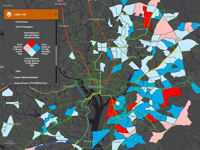
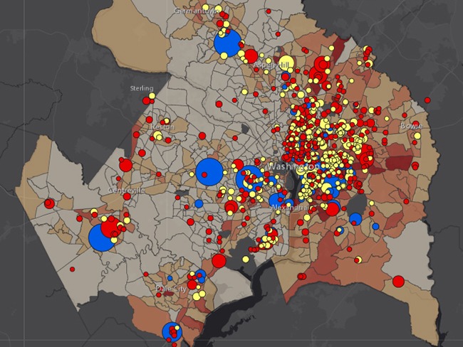
Select the layers ‘Transport: MetroRail’ and ‘Transport: MetroBus’ along with ‘Food Deserts & FI Population’ to explore this data on the Hunger Heat Map. - Every day, thousands of people all over the greater Washington region get the nutrition they need thanks to our partners, volunteers, and donors. There are people in every neighborhood across the region struggling to put food on the table. That’s why the food bank’s network of 450 partner organizations spans the nearly 1,750 square miles CAFB service area. On the map below, Partner Agencies and Direct Distributions Partners are marked with blue, yellow, and red dots. The larger the dot, the more meals distributed by the partner in that area, with the largest dots representing half a million meals or more distributed annually!
Select the layers ‘Need: Food Insecure Population’ and ‘CAFB Partners & Sites (CY19) – Meals Weighted’ to explore this data on the Hunger Heat Map. - This coordinated network of partners is providing 88,000 meals every day. Together through their partnership, hard work, and dedication, we help 10 percent of our region receive food when they need it each year. On the map below, the green areas illustrate where anywhere from 15,000 to upwards of 240,000 meals are distributed annually, with the darkest green areas representing the most meals provided. All this amounts to more than 30 million meals per year sourced and distributed to the people who need it most.
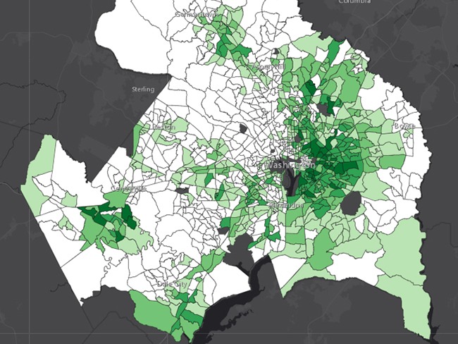
Select the layer ‘Impact: Meals Distributed’ to explore this data on the Hunger Heat Map.
This is just a handful of information you can find on the Hunger Heat Map. Click the button below to explore details by census tract, layer, and more.